You and I Are Polar Opposites Anime Poster Guide
Season 2’s promo art makes a strong case for poster form: pastel-to-neutral colors, clean spacing, and a quiet romcom mood that looks especially good on a bedroom wall.

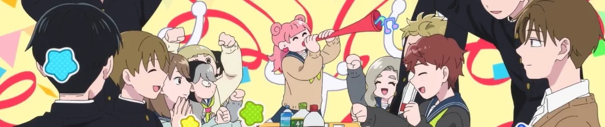
If you're checking on You and I Are Polar Opposites Season 2 and also hunting for a you and i are polar opposites anime poster, the key art is the real draw. The best visuals lean on pale pinks, cream tones, soft blues, and plenty of space between the leads, which makes them unusually easy to live with on a wall.
That airy look matters. A lot of romance anime promo art gets crowded fast, but this series works best when it stays light: clear silhouettes, simple posing, and backgrounds that give the characters room to breathe. From across a bedroom or study, that reads better than a busy ensemble image ever will.
Why the visuals work so well as posters
What I like here isn't loud detail. It's control. The strongest You and I Are Polar Opposites visuals usually keep the focus on distance, posture, and expression instead of piling on props or effects.
That's a good fit for poster art because the image still lands at a glance. You notice the gap between the characters, the slight turn of the body, the soft field of colour behind them. That mood hits first. Then the smaller details come in after.
For a romcom, that's exactly what you want above a desk or bed. Big action art can carry a wall through sheer impact. This show doesn't need that. It works by feeling calm and a little awkward in a charming way, and the promo art tends to sell that with open composition rather than noise.
The spacing does a lot of the storytelling. Two figures set slightly apart can say more than a packed cast image, especially for a series built on contrast and chemistry. If you're picking a print, look for visuals where the emotional push-pull is doing the heavy lifting.
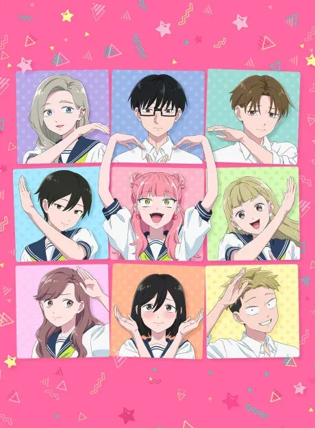
Best image types to choose for a you and i are polar opposites anime poster
Duo compositions are the safest bet. If both leads are in frame with a bit of breathing room between them, the poster keeps that soft romcom feel without turning the wall into clutter. Slightly off-center layouts work especially well because they feel natural, not stiff.
Soft-gradient backgrounds are another win. Pale peach, dusty blue, cream, light green, or a washed spring-sky backdrop all scale nicely at poster size. Those colours settle into a room instead of fighting everything around them.
I'd also put seasonal school visuals high on the list. Uniforms, understated smiles, and simple background treatment usually make the cleanest framed prints. Close-ups can work too, but only when the expression stays quiet. This isn't the kind of series I'd buy for exaggerated faces or heavy text blocks.
If you have a choice, skip art that's packed edge to edge with the full cast. Negative space matters here. That's just the blank area around the characters, but in this case it's doing half the mood work. Once that space disappears, the image loses the airy quality that makes it wall-friendly in the first place.
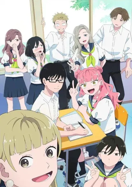
What to watch for in the artwork itself
The appeal is in how lightly the visuals sit on the frame. In the better promo pieces, the outlines look neat, the shapes stay easy to read, and the palette doesn't get muddy behind the characters. That helps a lot once the image is printed and viewed through glass.
Readability is the big thing. At poster size, you want faces that still feel expressive from a few steps back, hair shapes that don't blend together, and enough contrast between figure and background that the whole image doesn't wash out. Pastel art can fail there. This kind of key visual usually works because the neutral tones are balanced with just enough separation.
It's also the kind of art that fits a real room. One good print can sit near bookshelves, a desk lamp, bedding, or a small plant without looking swallowed up. That's why it makes sense for decor as much as collecting. You're not just buying a favorite series. You're buying an image that keeps the room calm.
And that's the poster angle in a nutshell: this show's visuals aren't trying to dominate a space. They soften it. For collectors who want anime on the wall without turning the room into a collage, that's a real selling point.
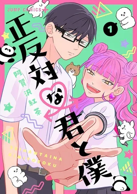
How to frame it and where to hang it
If you're building a clean romcom wall, keep the setup simple. One medium or large print is better than a tight cluster of smaller images. Give it room. This art needs empty wall space around it or the whole effect gets cramped.
Best placement? Above a study desk is the easiest win. The soft palette works well in a work corner because it adds personality without distracting from the rest of the setup. Above a low headboard also works, especially if your bedding sits in white, beige, pale grey, or sage.
For frames, I'd stick with white, light oak, ash, or thin champagne-toned metal. Those finishes keep the look light. Thick black frames can work, but only if the print already has wide pale margins; otherwise they can make a gentle image feel boxed in.
If your furniture leans warm wood, light oak is the best match. It picks up the warmth in the art without making it sugary. If your room is cleaner and more modern, white frames give that floating gallery look that suits pastel romance visuals really well.
Lighting that keeps the colours soft
Use warm-white light. Cold blue LEDs flatten pale art fast and can turn pinks and creams dull. A warm desk lamp, soft overhead bulb, or indirect lamp on the same wall will keep the print looking alive.
Watch reflections too. Standard framed paper behind glass is usually the best balance for this kind of image, but don't hang it opposite a bright window or mirror if you can help it. A soft visual loses a lot when glare cuts across the faces every afternoon.
Best print materials for this style
Paper is still the top choice. It handles gentle colour transitions well and keeps the image feeling clean. Matte or low-sheen finishes usually suit this show better than anything glossy.
Canvas can work if you like a warmer, softer finish, but it adds texture, and that texture can rough up a delicate image. Acrylic gives stronger pop, though it can feel too shiny for a quiet romcom setup unless the room is very minimal. I'd mostly skip metal for this one. It suits sharper, louder art better.
How to build an airy anime wall around it
If you're pairing this with other prints, stay restrained. A clean romance setup falls apart fast when one high-contrast battle poster starts yelling over everything else. Keep companion pieces pale, simple, or at least calm in layout.
Comedies and slice-of-life prints usually pair better than dark action art. Domestic visuals, school visuals, or character pieces with lots of open background will keep the same easy pace. If you want a mixed wall, make this poster the centerpiece and place anything darker or busier on another wall instead of right beside it.
Frame consistency helps more than matching franchise mood. Use the same frame family across the room and let the colours do the separation. That keeps the setup feeling collected rather than random.
This is also a smart pick for small rooms. Because the palette sits in that pastel-to-neutral range, the poster won't make the space feel heavier. It actually does the opposite. It opens things up a bit, especially when paired with light bedding, pale curtains, wood shelving, or off-white walls.
So if Season 2 is already on your mind, the poster case is pretty strong. Go for a duo key visual, keep the frame light, leave space around it, and let the soft composition do its job. This series looks best on a wall when it stays exactly what it is on screen: warm, awkward, and easy to keep looking at.
Related: Itachi Uchiha Naruto Poster – Japanese Ink Style Anime Wall Art | Akatsuki Decor · Madara Uchiha Naruto Poster – Susanoo Anime Wall Art | Legendary Uchiha Decor · Muzan Kibutsuji Demon Slayer Poster – Dark Anime Wall Art | Kimetsu no Yaiba · Browse the full catalogue
Frequently Asked Questions
The article doesn’t confirm a streaming platform. Check official anime announcements and your region’s licensed services for the latest availability.
The article doesn’t verify a Crunchyroll listing, so treat that as unconfirmed unless Crunchyroll or the show’s official channels announce it.
Its poster appeal comes from soft pinks, creams, pale blues, and generous negative space, which make the characters easy to read and the image calm on a wall.
A single medium or large poster usually works best. It gives the art room to breathe and keeps the wall looking clean instead of crowded.
Framing is usually the better choice for pastel art. A white, light oak, or thin metal frame helps preserve the soft look and keeps the print from feeling flimsy.
Our paper posters are printed on 300 GSM art board — thick, sturdy, and fade-proof with OEKO-TEX certified inks. We also offer canvas (poly-canvas on wooden stretcher frame), acrylic (3 mm glossy UV-printed), framed (1" black or white frame with laminated finish), and metal (1 mm aluminium with magnets). Every format is gallery-grade.
Every poster is made to order and typically arrives within 3-7 business days across India. Paper posters ship in protective carton tubes; framed and acrylic prints ship in rigid packaging. You'll receive a tracking link via email and SMS as soon as your order ships.
Shipping is free on every order, whatever you buy, and there is no minimum order. Where cash on delivery is offered, it adds a ₹40 handling fee; paying online has no extra charge.
More questions? See the full FAQ.
Ready to Fill the Walls?
Premium anime posters, printed on gallery-grade 300 GSM stock. Made to order, shipped across India.
Shop PostersMore from the Hub
 guide
What DPI Do Pro Players Use? What Matters More for Aim
Pro players often use 800 or 1600 DPI, but the real difference comes from in-game sensitivity, polling rate, and sensor quality. Learn a setup that fits your game, grip, and desk space.
 guide
Jujutsu Kaisen Posters: Which Sorcerer Belongs on Your Wall?
Jujutsu Kaisen Part 2 has no release date yet. Here is how to choose between 18 Jujutsu Kaisen posters, sorted by sorcerer, with a side-by-side of the three Toji designs.
 guide
Demon Slayer Posters: Pick by Art Style While You Wait for Part 2
No release date has been announced for Demon Slayer: Infinity Castle Part 2. Here is how to choose a poster from the Demon Slayer range by art style, and how to group them.