Though I Am an Inept Villainess Anime News and Poster Appeal
Though I Am an Inept Villainess is airing now, and the court-drama visuals are already drawing collector attention. See the watch update, then why its ornate style works as elegant wall art.


The big update in though i am an inept villainess anime news is that this isn't a distant announcement anymore. Though I Am an Inept Villainess is airing in Summer 2026, listed for 11 episodes, with episode 9 set for 2026-09-06 at 20:16 IST, so collectors and weekly watchers are looking at an active seasonal right now rather than a maybe-later title.
It also has the kind of courtly look that naturally puts poster talk on the table. If the official art and key visuals keep leaning into ornate costume shapes, soft colour choices, and formal staging, this could be one of those romance-drama series that works as clean wall art instead of just watchlist filler.
What the current Though I Am an Inept Villainess anime news means
Right now, the practical part is simple. Though I Am an Inept Villainess, also known as Futsutsuka na Akujo de wa Gozaimasu ga: Suuguu Chouso Torikae Den, is marked as currently releasing as part of the Summer 2026 season, with an 11-episode run.
For streaming, it is listed on Crunchyroll, Bilibili TV, Disney Plus, Netflix, and Laftel. As always, availability can change by region, so what shows up for one viewer may not show up for another. If you're following the schedule from India, episode 9 is the next stop on 2026-09-06 at 20:16 IST.
That alone explains why the series is getting more attention now. Week-to-week anime always sparks more talk once people can actually watch it, react to new episodes, and judge the adaptation in real time. The Doga Kobo label adds interest too, especially for viewers who like romance and drama with a more polished, court-focused look.
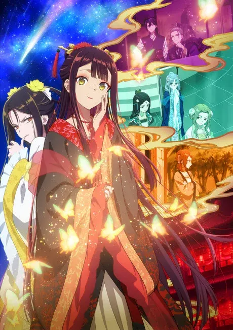
Why people are watching this adaptation closely
The draw here isn't hard to read. The story appears to center on court intrigue, identity tension, status pressure, and character drama that depends on expression and social atmosphere as much as plot turns. That's a format anime can handle well when the direction pays attention to faces, pauses, framing, and costume presence.
Doga Kobo is often praised by fans for expressive faces and mood in some of its work, so it's easy to see why people are curious about this match. For a title like this, the interesting craft details aren't giant action cuts. They're smaller things: how long a reaction shot holds, how linework sits on a composed close-up, how sleeves and hair ornaments move in a turn, and how a formal room changes the feel of a confrontation.
If the adaptation emphasizes polish over spectacle, that could suit the material. Court drama usually benefits from backgrounds that feel ordered, costumes that read clearly, and staging that makes rank, distance, and hesitation visible inside the frame. When that part works, even a quiet scene can feel charged.
That's also where the collector angle starts to matter. A lot of seasonal anime live and die by movement. This kind of series may get more value out of stillness. If a show can sell tension through posture, silhouette, and colour balance, it has a better chance of producing key art that actually deserves frame space.
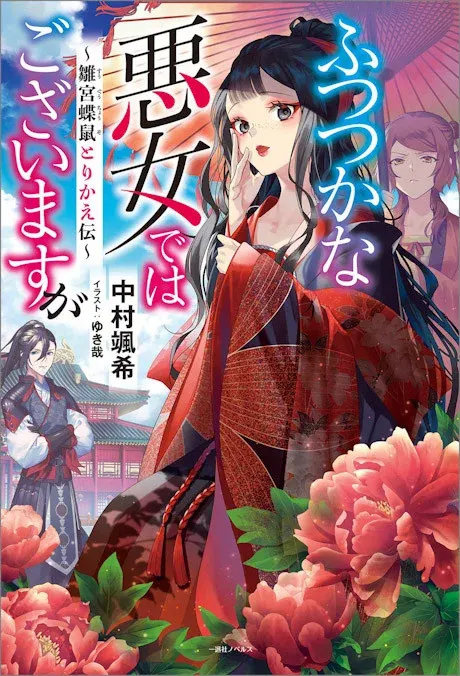
Why its visual identity could translate well to posters
I wouldn't call any unreleased visual promise guaranteed, but this series looks like a strong poster candidate on paper. The court setting suggests layered clothing, hair ornaments, and formal staging. Those are useful design tools because they give a single image shape even before you add motion or effects.
One likely strength is silhouette. Court-focused anime often uses profile shots, long sleeves, layered hair shapes, and upright formal poses to separate one character from another. From a wall-art angle, that's huge. A poster has to read from across the room first and reward a closer look second. Clean silhouettes do that better than busy action clutter.
Costume detail helps too. Robes, trim, collars, and accessories can give a print texture without making it noisy. That's why drama series with ornate clothing often make better framed art than people expect. The image already has built-in detail from the design work itself, so it doesn't need speed lines or explosive effects to feel full.
I'm also hoping for balanced compositions. Palace and court imagery can look great when doors, pillars, screens, and corridor depth shape the shot. That kind of layout can translate well into posters because the frame already feels organized. You don't need much more than a good crop, strong character placement, and enough negative space to let the costume work breathe.
The colour side matters just as much, though I'd keep it in the realm of expectation rather than certainty. If the anime leans into pale pinks, creams, powder blue, jade, or brushed gold, those tones could fit nicely in a bedroom, study, or reading corner. Personally, I think softer palettes are easier to live with day to day than loud effect-heavy prints. They feel calmer on the wall and let the linework do more of the talking.
What kinds of images would make the best collector prints
If you're thinking like a collector, the most appealing images here probably won't be action-first shots. I'd look more at formal confrontation scenes, ceremonial interiors, two-character compositions with mirrored spacing, or solo portraits where the full costume can actually be seen.
A corridor shot with a character looking back over one shoulder would be a strong pick. So would an audience chamber composition with architecture framing one central figure. Even a close two-shot could work if the posture contrast is sharp enough and the clothing shapes stay readable.
This is one of those titles where a still frame may work better than a busy montage poster. If you're after elegance, a single composed image usually says more than a collage. You want room for the costume design, room for the staging, and enough restraint that the emotional tension isn't buried under logos and cut-ins.
That's why the visual craft matters so much here. A good print from this kind of show would likely depend on layout, colour balance, and line clarity more than raw motion. If later episodes start leaning harder into repeated palace spaces, deliberate character spacing, or costume colour contrasts, that's the point where the strongest poster imagery may start to show up.
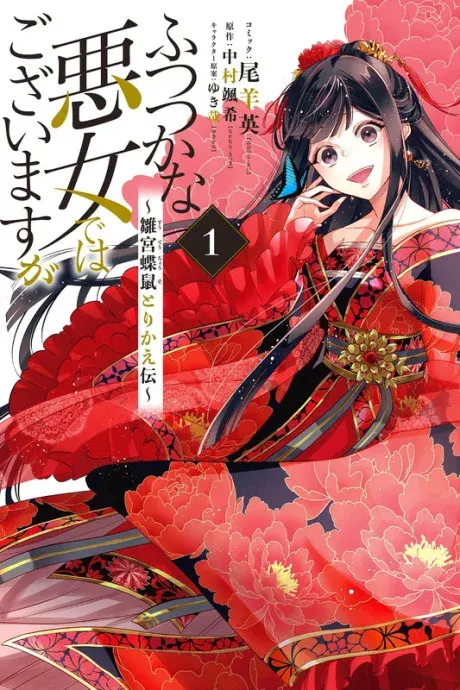
How I'd style a room around a Though I Am an Inept Villainess print
If you want this series on the wall, I'd treat it as elegant decor first and fandom decor second. That usually means giving the art breathing room instead of cramming it into a loud cluster.
Frames, placement, and lighting
For frames, I'd lean toward thin gold, champagne, ivory, or light walnut if the artwork stays soft and courtly. Those finishes tend to sit well with pale palettes and ornate costume detail. Black can still work, but I'd save it for art with stronger line contrast or a darker background.
Placement depends on the piece, but a centered spot above a desk, low bookshelf, or sideboard makes sense to me for a formal key visual. If the composition uses symmetry, giving it a clean wall helps that structure read properly. It could also work on the first wall you see entering the room, especially if the image is calm rather than dramatic.
Warm white lighting can work well with delicate colour palettes. A nearby lamp or soft accent light will often flatter pale pinks, creams, and gold notes better than harsh overhead lighting. I wouldn't make that a hard rule for every setup, but it's a good starting point if you want the print to keep its softness.
Paper, canvas, or acrylic
For a delicate court-drama image, my first choice would usually be framed paper. It tends to keep linework crisp and lets costume patterns stay readable. If the official art goes heavy on fine facial work, jewelry, or ornamental trim, paper is often the safest bet.
Canvas could work if the art leans painterly or uses softer background textures. You'll usually trade some sharpness for a warmer, more decorative finish. That can be a nice match if you want the piece to blend into the room instead of reading like a glossy promo image.
Acrylic is worth considering only if the artwork ends up more polished and glossy. If future visuals use layered lighting or richer jewel-toned interiors, acrylic could make those colours pop. I'd use it in a cleaner, more modern room rather than a setup that leans vintage or old-world.
For pairings, I'd keep neighboring prints controlled. A quieter family or slice-of-life piece could sit beside this kind of art without overwhelming it. If you want contrast, one darker single-character poster could anchor the wall. I just wouldn't crowd it with battle-heavy work. The mood clash would be obvious.
What to watch for as the season continues
With episode 9 next on the schedule, the interesting question isn't just plot. It's whether the anime sharpens its visual language as it heads toward the end of an 11-episode run. Drama-romance series often get more visually precise late in the season, especially when the relationships settle into clearer emotional patterns.
If you're watching with a collector's eye, pay attention to framing, posture, and repeated locations. A robe colour that keeps showing up, a particular chamber used at key moments, or a recurring two-character composition can turn into the image fans remember most. Those motifs also tend to produce the best poster material because they carry story weight without needing a full scene around them.
I'd also watch how the show handles distance between characters. In this kind of material, a step forward, a held bow, or one person standing centered while another hangs back can say more than a line of dialogue. That's the sort of visual storytelling that gives a series a real afterlife in still images.
So if you're here for though i am an inept villainess anime news, the short version is easy: it's airing now, episode 9 is next, and the streaming footprint is broad enough that most fans can at least check their local platform options. The more interesting part, though, is how the adaptation may develop as a visual object. If the official art and episode staging keep landing, this could be one of those romance-drama titles that isn't just worth watching. It could be worth hanging up too.
Related: Benimaru Shinmon Fire Force Poster – Ukiyo-e Japanese Anime Art · Shinra vs Arthur Fire Force Poster – Anime Rivalry Manga Art · Fire Force Company 8 Anime Poster – Shinra Kusakabe & Arthur Boyle · Browse the full catalogue
Frequently Asked Questions
Yes. The article says Though I Am an Inept Villainess is currently airing in Summer 2026, so it is an active seasonal anime rather than a future announcement.
It is listed on Crunchyroll, Bilibili TV, Disney Plus, Netflix, and Laftel. Availability can vary by region, so viewers should check their local catalog.
The series is listed for 11 episodes.
It is a court-drama story, also known as Futsutsuka na Akujo de wa Gozaimasu ga: Suuguu Chouso Torikae Den, centered on identity tension, status pressure, and palace intrigue.
It is trending because it is now actively airing, has a clear weekly schedule, and is getting attention for its polished court-focused visuals and Doga Kobo production interest.
Our paper posters are printed on 300 GSM art board — thick, sturdy, and fade-proof with OEKO-TEX certified inks. We also offer canvas (poly-canvas on wooden stretcher frame), acrylic (3 mm glossy UV-printed), framed (1" black or white frame with laminated finish), and metal (1 mm aluminium with magnets). Every format is gallery-grade.
Every poster is made to order and typically arrives within 3-7 business days across India. Paper posters ship in protective carton tubes; framed and acrylic prints ship in rigid packaging. You'll receive a tracking link via email and SMS as soon as your order ships.
Shipping is free on every order, whatever you buy, and there is no minimum order. Where cash on delivery is offered, it adds a ₹40 handling fee; paying online has no extra charge.
More questions? See the full FAQ.
Ready to Fill the Walls?
Premium anime posters, printed on gallery-grade 300 GSM stock. Made to order, shipped across India.
Shop PostersMore from the Hub
 guide
What DPI Do Pro Players Use? What Matters More for Aim
Pro players often use 800 or 1600 DPI, but the real difference comes from in-game sensitivity, polling rate, and sensor quality. Learn a setup that fits your game, grip, and desk space.
 guide
Jujutsu Kaisen Posters: Which Sorcerer Belongs on Your Wall?
Jujutsu Kaisen Part 2 has no release date yet. Here is how to choose between 18 Jujutsu Kaisen posters, sorted by sorcerer, with a side-by-side of the three Toji designs.
 guide
Demon Slayer Posters: Pick by Art Style While You Wait for Part 2
No release date has been announced for Demon Slayer: Infinity Castle Part 2. Here is how to choose a poster from the Demon Slayer range by art style, and how to group them.