The Guy She Was Interested in Wasn't a Guy At All News
The Guy She Was Interested in Wasn't a Guy At All lands with a January 8 premiere, soft music-club mood, and a neon-green visual identity built for clean, modern wall art.
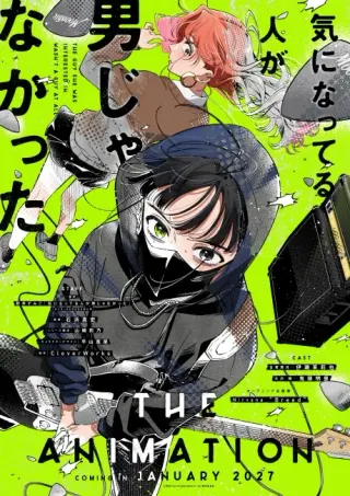
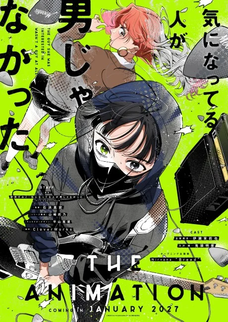
That neon green says plenty
The first thing that sticks is the colour choice: acid green pushed against soft skin tones and clean black shapes. That alone gives The Guy She Was Interested In Wasn't a Guy At All a distinct look. If you're here for the latest news, the anime is set for a January 8 premiere. The first promo also suggests a quieter, music-club-focused tone with a visual style that may appeal to poster-minded fans.
The short version
- Premiere is confirmed for January 8; episode 1 is scheduled for 2027-01-08 19:30 IST.
- CloverWorks is animating, and the first promo leans more into mood than big drama spikes.
- The promo seems to frame it as a soft romance with music-club energy and chemistry-first character beats.
- Its muted palette and clean linework may work especially well for modern, minimal poster styling.
Fact file
The Guy She Was Interested In Wasn't a Guy At All
Confirmed timing, studio, genres, and listed streaming platform at a glance
- Status
- Not yet released
- Season
- Winter 2027
- Studio
- CloverWorks
- Genres
- Music, Romance
- Next episode
- Ep 1 · 2027-01-08 19:30 IST
Where to watch
- Crunchyroll
Episode 1 airs · Fri, 8 Jan, 7:30 pm IST
Episode 1 airs Fri, 8 Jan, 7:30 pm IST.
Crunchyroll is listed as a streaming platform; availability in India varies by service.
What the first promo actually confirms
The Guy She Was Interested In Wasn't a Guy At All premieres on January 8, with episode 1 scheduled for 19:30 IST on 2027-01-08. Crunchyroll is listed as a streaming platform, with availability varying by region. The AniList facts place it in Winter 2027, with CloverWorks on animation production and Music, Romance as the core genre mix.
My read on the first promo is that it points to a gentler tone. Rather than playing up broad comedy, it seems to lean on close facial acting, held reactions, and a music-club setting. The shot choices on glances, side profiles, and shared space also make it read as more chemistry-led than punchline-led. To me, that's often a promising sign for a quieter romance.
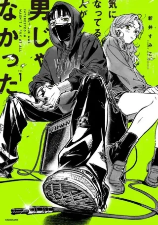
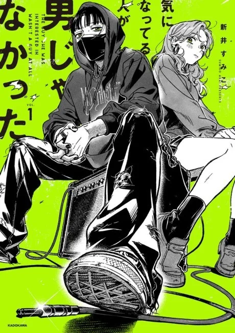
CloverWorks knows when to stay soft
To my eye, the promo's appeal is restraint. The linework looks clean. Faces do the heavy lifting. Rather than piling on effects, it lets muted greens, blacks, and skin-tone warmth set the mood. That's part of why I think the imagery could translate well to a poster. A poster doesn't get motion, voice, or score to help it. It needs a silhouette, a palette, and a relationship dynamic that reads in one glance.
I think the music-club angle helps. Instruments, cables, amps, and rehearsal-room blocking create diagonals and depth without cluttering the image. Even a simple seated pose can start to feel editorial. That's a strong lane for a music-club romance poster: intimate and contemporary without shouting. If your room already has neutral walls, a desk lamp, and black or light-wood shelving, this kind of art may fit better than a maximal key visual.
My favourite promo beats for poster use are the ones built on distance and tension, not plot. A side glance across a room. One character seated, one standing. The green wash meeting darker clothing. Those are strong static-image ideas because they keep the emotional charge inside quiet compositions.
Quick poll
What's the stronger poster hook in this promo style?
Why this art could hang well
If you were turning this series into wall art, I'd avoid overcrowded montage layouts. I think these visuals work better with breathing room. As a general rule, thin linework and restrained contrast tend to print better in compositions with one dominant pose, one accent colour, and a clear focal path. Here, the cable curves, amplifier edges, and offset character placement already do that work.
That also makes the finish worth thinking about. Soft palettes can sometimes flatten on the wrong surface. On plain poster paper, the green accent should still pop, but the gentler tonal shifts may need good lighting. I'd go with a thin black, white, or light oak frame if you want a clean, modern look. Canvas can work, but the texture may fight delicate linework. Acrylic could look great with more graphic, high-contrast art, though for a quieter romance image I'd probably still pick framed paper.
Best finish for this visual language
Best match. Clean paper keeps the linework crisp and the pastel-to-neon balance intact. If you're hanging it above a desk, this is the finish that feels most like a contemporary manga cover brought to room scale.
The safest collector choice. Add a thin black, white, or light oak frame and the series instantly looks tidier and more deliberate. It suits uncluttered rooms and gives soft colours enough structure.
Not my first pick. Canvas adds texture, but I'd want this title on a cleaner surface for the linework and colour blocks. Too much surface grain can sometimes blunt that.
Good if you want gloss. Acrylic can make the green accents feel sharper and more design-led, but I'd save it for a composition with strong contrast. For quieter romance scenes, it may feel a little too polished.
Posters with the same energy
We don't stock this franchise, so I'd shop by mood instead. If you liked the promo for its soft melancholy, clean composition, or relationship-first framing, look for posters that do the same on a wall. Anohana Anime Poster – Menma & The Lost Summer has that airy emotional spacing. I Want to Eat Your Pancreas Anime Poster – Sakura & Spring Memories hits a similar modern-romance softness. Rascal Does Not Dream of Bunny Girl Senpai gives you contemporary character focus with a cleaner edge. And if you want the music-club cool translated into moody urban restraint, Smoking Behind the Supermarket with You Anime Poster is the left-field pick.
On the wall
Posters with the same energy
Not from this series, but each one echoes its quiet chemistry, clean framing, or soft emotional pull.
How I'd style it in a room
Hang this kind of art where you actually sit still: above a desk, near a bookshelf, or beside a small music corner with headphones or speakers. Use soft white or warm-neutral lighting, because cool blue bulbs will flatten the warmer skin tones and make the green feel harsher than it should. Keep the surrounding decor disciplined. One framed print, a lamp, a stack of records or manga, maybe a plant. Done.
For pairings, stay in the same emotional register. Anohana works if you want wistful softness. I Want to Eat Your Pancreas works if you want romance that feels light but not childish. Rascal Does Not Dream of Bunny Girl Senpai fits if your room already leans sharper and more urban. The mistake would be putting this aesthetic next to battle-heavy crimson or high-saturation shonen art. Your wall needs the contrast to feel intentional, not accidental.
On the wall
Room-friendly pairings
These picks keep the wall clean and expressive, which fits the softer, more modern look the new CloverWorks romance seems to be aiming for.
Related: Browse the full catalogue
Frequently Asked Questions
It is confirmed to premiere on January 8, with episode 1 scheduled for 2027-01-08 at 19:30 IST.
Crunchyroll is listed as a streaming platform for the anime, but availability can vary by region, including India.
The article confirms the series and promo timing, but it does not list specific cast members. The promo emphasis is more on tone, chemistry, and visual presentation.
CloverWorks is animating the series.
It is a music and romance story centered on a softer, chemistry-driven relationship, with the promo framing the series around close character moments and a music-club setting.
Our paper posters are printed on 300 GSM art board — thick, sturdy, and fade-proof with OEKO-TEX certified inks. We also offer canvas (poly-canvas on wooden stretcher frame), acrylic (3 mm glossy UV-printed), framed (1" black or white frame with laminated finish), and metal (1 mm aluminium with magnets). Every format is gallery-grade.
Every poster is made to order and typically arrives within 3-7 business days across India. Paper posters ship in protective carton tubes; framed and acrylic prints ship in rigid packaging. You'll receive a tracking link via email and SMS as soon as your order ships.
Shipping is free on every order, whatever you buy, and there is no minimum order. Where cash on delivery is offered, it adds a ₹40 handling fee; paying online has no extra charge.
More questions? See the full FAQ.
Ready to Fill the Walls?
Premium anime posters, printed on gallery-grade 300 GSM stock. Made to order, shipped across India.
Shop PostersMore from the Hub
 guide
What DPI Do Pro Players Use? What Matters More for Aim
Pro players often use 800 or 1600 DPI, but the real difference comes from in-game sensitivity, polling rate, and sensor quality. Learn a setup that fits your game, grip, and desk space.
 guide
Jujutsu Kaisen Posters: Which Sorcerer Belongs on Your Wall?
Jujutsu Kaisen Part 2 has no release date yet. Here is how to choose between 18 Jujutsu Kaisen posters, sorted by sorcerer, with a side-by-side of the three Toji designs.
 guide
Demon Slayer Posters: Pick by Art Style While You Wait for Part 2
No release date has been announced for Demon Slayer: Infinity Castle Part 2. Here is how to choose a poster from the Demon Slayer range by art style, and how to group them.